Of the world’s estimated 6,800 languages, nearly half still don’t have their own version of the Bible. According to Wycliffe Bible Translators (Orlando, FL) — whose mission is to see translation in progress among every language group by 2025 — this equates to approximately 380 million people who don’t have a translated version of God’s Word.”
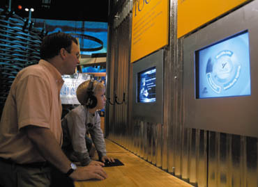
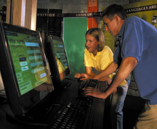
To promote its vision, Wycliffe has established the WordSpring Discovery Center, which enables guests to explore the history of the Bible, the world’s languages and the ongoing work of Bible translation via multimedia presentations, interactive computer games, simulations, audio dramas, live field updates and hands-on activities. Simply put, the Orlando-based exhibit dishes up an inspiring, out-of-this-world experience.
Roswell, GA-based Lorenc+Yoo Design, which served as WordSpring’s exhibit designer, sought to create an environment that would “read” on many levels — in other words, communicate with both formal and informal visitors. To achieve this goal, the design team, comprising Jan Lorenc, design director; Chung Yoo, project manager; and Susie Caldwell Norris, graphic designer, designed the exhibit to communicate through spatial ambience.
To create a “hands-on” experience, the designers employed primitive, architectural forms and materials; to create an “earthy” appeal, they incorporated such materials as textured stucco, stacked fieldstone, corrugated galvanized metal, woven wood, horizontal planks and split-face concrete block.
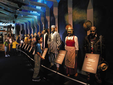
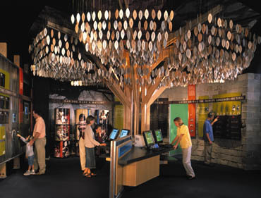
For other interior spaces, such as the “Bible” area, Lorenc+Yoo implemented soft materials, light colors, white light and a lowered ceiling plane to create an ethereal atmosphere. Furthermore, hierarchical graphics and interactive exhibits, in each of WordSpring’s five distinct areas, communicate information in a fun and interesting way.
According to Lorenc, “Each area of the self-guided exhibit is a focused environment. The spatial configuration, imagery and text content within each area are designed to communicate to visitors on both an intellectual and emotional level.”
Introductory kiosks, which resemble educational easels and feature graphic summary panels, announce each area’s entrance and communicate primary, overarching messages or thought-provoking questions. To achieve consistency between the areas, a horizontal title band, which follows the perimeter walls within each space, forms a unifying datum line to which graphics can connect and relate.
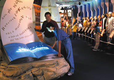
Further exhibit features include a large, internally illuminated, cast, amber-glass Bible, which sits atop a boulder, and a translucent-acrylic world map comprising dusted, crystal-vinyl continents. From the Bible, streams of scrambled letters and copy, depicting different translated languages, emanate to create a multi-banded word arch overhead. The map sculpture, Lorenc noted, represents the Bible as the “light unto the world.”
The existing exhibit occupies 4,500 sq. ft. However, Lorenc+Yoo developed a master plan for an eventual 30,000-sq.-ft. museum. Not surprisingly, this double duty proved daunting.
Lorenc explained, “Designing the 4,500-sq.-ft. space was challenging because a large portion of the planned, 30,000-sq.-ft. space had to be incorporated into this ‘Cliff Notes’ version. We maintained focus by ensuring that the smaller space’s layout couldn’t be seen in one fell swoop — we wanted visitors to focus on one area at a time and have limited vision of other exhibit areas. This way, no surprises were given away too soon.”
He also cited color as a key exhibit component. He wanted to show a color progression, as opposed to overwhelming visitors with a barrage of colors in a single exhibit area. Too much color would make the exhibit areas chaotic and their “stories” difficult to comprehend. Similarly, each exhibit’s content needed to inform and entertain, not overwhelm, visitors.
“The exhibit-editing process was challenging,” Lorenc commented. “We worked closely with the client to ensure the content being presented wouldn’t overwhelm readers. We wanted to present the right amount of pertinent information and keep the in-depth information on the interactive monitors for people to access.”
The project, which required three years to complete, allowed Lorenc+Yoo to hone its skills in industrial design, architecture, interior design, graphic design, model building, computer animation, lighting design, sound integration and project management.
Lorenc concluded, “We gained a lot of experience from this project, including how to manage the expectations of all parties involved. We’re proud of the outcome and look forward to growing equally with future clients having similar, immerse challenges.”
For the convention balroom’s exterior facade, Lorenc+Yoo designed 7-ft.-tall letters, which spell out the resort’s name.
WordSpring’s exhibit designer Lorenc+Yoo (Roswell, GA) sought to create an environment, which would read on many levels. To create an earthy look, the firm incorporated such humble materials as textured, stacked fieldstone, corrugated galvanized metal, woven wood, horizontal planks and split-face concrete block.
To create a “hands-on” experience, the designers employed primitive, architectural forms and materials.
Exhibit-Design Process
Roswell, GA-based Lorenc+Yoo Design implements the following process to ensure effective and comfortable communication and organization of the overall execution of goals:
* Foster an environment that nurtures the mission and vision.
* Invite and motivate visitors to share the mission.
* Maximize the storyline communication — develop a message that informs, educates and engages visitors.
* Create a memorable exhibit experience that inspires, motivates and stimulates visitors.
* Assist self-guided flow and circulation through the exhibit — allow for a sequential story but ensure random browsing.
* Allow for expansion and flexibility — consider the needs for further expansion in a master plan.
* Create various exhibit displays within an organizing scheme.
* Help the client design a cost-effective solution, which maintains the story and overall quality goal.
* Communicate the narrative in a creative, imaginative and visually appealing way, but don’t allow exhibition-design features to overwhelm the message.


 Tip Sheet3 days ago
 Business Management2 weeks ago
 Women in Signs2 weeks ago
 Real Deal4 days ago

 Editor's Note1 week ago
 Line Time2 weeks ago
 Product Buying + Technology1 week ago