Late in 1998, the American National Standards Institute (ANSI) published its new ANSI A117.1-1998 standards for Americans with Disabilities Act (ADA) signage. Also, the nearly identical federal ADA Accessibility Guidelines (ADAAG) have been presented for final comment. The final version is now being integrated with Title II guidelines for state and local government facilities, the Uniform Federal Accessibility Standards (UFAS) for federal facilities and fair housing standards.
So what does that mean? It means that the federal ADAAG have changed very little since their 1992 inception (although individual states can and have adopted more stringent standards), and, as of mid-January, ANSI A117.1 has the only final and published changes for accessible buildings and facilities. In terms of signs, the new standards enhance, rather than conflict with, old standards. Similarities between ANSI A117.1 and ADAAG aren’t surprising, because most of the same people worked on both projects.
Real change
Of course, real change at the local level will finally come when states adopt new building codes based on the new ANSI or ADAAG, and when individual building inspectors begin to apply the codes as they investigate new and remodeled buildings. So do the new ANSI standards affect your ADA signs today? What guarantee is there that the new, finalized federal standards will replicate ANSI?
We all know there are no guarantees when it comes to the Feds. But because the new ANSI standards are like the old ones, yet even more clear and consistent, you can begin using most of the new standards immediately.
In the few cases where the new standards conflict with the old, the new ones often can be used in cases of equivalent facilitation, which will be addressed shortly. This will provide better accessibility for many facilities and solve problems of barrier removal in older facilities.
The new ANSI standards
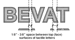
The new standards for braille and raised-character signs, which identify permanent rooms and spaces, focus on more readable tactile elements. Tactile letters will be sans serif only, with no italics, oblique, decorative or "unusual" styles. Character and stroke proportion are controlled, as is the space between characters, and the space between text and braille (or other raised elements). Raised text must be at the base of the text, which can be no higher than 60 inches from the floor.
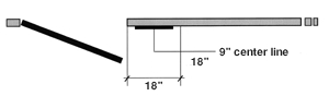
Braille must have rounded or domed dots and be placed below the text. For most braille text, the two dot-sixes used to show all upper-case letters will be dropped. In cases where a sign is placed next to a door that opens out, the horizontal center of the sign needs to be 9 inches from the edge of the door.
These specs were added because "minimums" often became "maximums," and ambiguous suggestions were ignored. For example, the term "simple" serif caused great confusion because it had no criteria; anything could pass as "simple." Legitimate styles, such as Optima or Poppi, were classified as sans serif anyway.
Tactile readers need classic character forms to distinguish "A" from "R," for example. Serifs cause confusion, especially when adjacent ones nearly touch. When spacing between characters is reduced, they become less distinct.
Similarly, bold, condensed characters are difficult to read; the counters in "A," "O" and "R" can practically disappear. Tactile readers need a slender character stroke, but not to the point of distortion.
The shape of the braille dot is important as well. Square, flat-top dots can snag fingers and "cloud" the image of each cell. Those who read braille signs are often inexperienced, and the rounded or domed dots assist them. Upper-case letter indicators generally slow readers. Who cares if "restroom" is capitalized in braille?
Visual signs
The same style restrictions apply to a sign’s visual components, but serif typestyles and upper- and lower-case letters are fine. Letter-height limits are more specific, based on the height of the sign and the distance from which it will be read. The higher it is on the wall and the further away from the reader, the larger the text must be. Specs for pictograms and symbols of accessibility remain essentially the same, but the pictogram standards are more easily understood.
Visibility is the major concern. ADAAG said upper-case letters must be at least 3 inches high when situated 80 or more inches above the floor, but didn’t specify any other installation heights. ANSI-1992 added some, but ignored viewing distance. What good is an eye-level sign if the letters are small, and a counter keeps the readers 10 feet away?
The 3-inch-high rule remains in effect, and a new chart addresses signs from 40 to 120 inches high. The chart best applies to old buildings, such as a small hospital with narrow hallways, in which 3-inch-tall letters aren’t possible for all overhead signs.
Equivalent facilitation
This term comes into play when space problems or characteristics of the intended sign’s audience limit the effectiveness of normal standards. People who frequent certain buildings may have limited reach or be confined to wheelchairs. The law permits barrier removal in a problem-solving fashion.
Anyone who’s attempted to replace an entire sign system in an older building understands the frustration of not being able to put tactile signs on doors. Sometimes, adjacent space just doesn’t exist. For example, an old hotel may willingly replace signs, but can’t afford to refinish all the doors. Plus, they would argue that their patrons are accustomed to looking for signs on the doors.
The new ANSI standards and the proposed ADAAG sometimes offer relief. For example, a tactile sign may be installed on a door that opens inward, has an automatic closer and no hold-open device. Most hotel rooms and apartments pass this test, as do many restroom doors.
Why the turnaround? The ANSI Sign Task Force realized that, in the above scenario, all its reasons for locating signs on the latch-side wall were invalid. A door that opened inwardly couldn’t possibly hit a reader in the face. Because the door couldn’t be propped open, it couldn’t hide the sign. And although locating signs in the exact same location in every building remains the ideal, it’s impractical. Other options might place the sign too far away to be effective. Placement on the door just seemed logical.
Another location issue involves the 60-inch-on-vertical-center rule, meaning the center of the sign should be at the 5-foot level. New standards will allow tactile characters to be as low as 48 inches in, for example, nursing homes, independent living centers and elementary schools. The 60-inch rule remains in effect, but now there’s a clear standard for equivalent facilitation.
Rounding things out
The new standards include two other important provisions that give designers more options. Standards now provide for beveled or rounded tactile characters, which are easier to read by touch than straight-side characters. They allow characters to be closer together visually and permit bolder typestyles. The visual reader sees the character from its base, while the tactile reader only feels the more slender top surface.
Other standards, based on the work of New York’s Roger Whitehouse, allow separate visual and tactile elements on identification signs. This "best of both worlds" approach makes signs easier to read by both touch and sight, because the visual text can be upper- and lower-case and reasonably bold. The tactile characters can be even more vandal-resistant, because shiny metals or contrasting backgrounds aren’t an issue on the sign’s tactile portion.
Conclusion
Clearly, the new ANSI standards offer more additions, refinements and clarifications than actual changes. Even if we implement the new standards immediately, where they won’t directly conflict with ADAAG or state guidelines, the signs probably will be more useful to people with disabilities than most current sign systems. We also have the chance to design more creative, attractive signs that still meet accessibility guidelines.


 Tip Sheet1 week ago
 Photo Gallery3 days ago
 Ask Signs of the Times5 days ago
 Real Deal2 weeks ago
 Benchmarks1 week ago
 Paula Fargo11 hours ago
 Photo Gallery11 hours ago
 Women in Signs2 weeks ago