An idea sparks a concept, which ultimately fulfills a need. Oscar Hammerstein wisely said, “If you don’t have a dream, how’s it going to come true?” This level of brainstorming has helped our business succeed for nearly four decades.
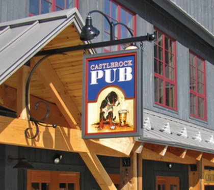
Warren, VT’s Sugarbush Ski Resort, a client for 35 years, recently renovated its ski village, and its recently opened Castlerock Pub had become so successful that it needed expansion. This growth required new signage, and the customer also used our logo to develop advertising and print T-shirts and other collateral materials.
Creating a sense of place
Sugarbush’s management team chose an English-style motif — with a Vermont twist. Enter Jenn Whittingham, our senior designer and art director; Jason Lisai, Sugarbush’s construction VP; and Win Smith, the resort’s owner and general manager. Jenn professed a strong love for English pub signage and provided ample reference material. I also pored over books and photographs from my trips to Great Britain to embark on our design adventure.
In my experience, few things in life offer more excitement than sharing a design goal with your customer – particularly when they’re knowledgeable and appreciate your vision.
Advertisement
As I researched pub signs, I noted a strong tendency toward blade or projecting signs; an object or animal typically serves as the centerpiece. Jason noted the expanded pub’s architecture would feature a gabled roof over the new entrance – a perfect opportunity for a blade sign. With an emerging concept in mind, we consulted Win for input.
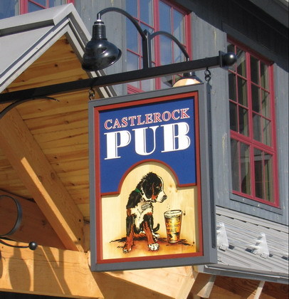
First, a brief history about Castlerock. Most New England skiers know about Sugarbush, and the well initiated often test their mettle on one of the five infamously challenging runs accessible from the Castlerock lift. Gnarly rocks and twisted trees cover the Castlerock slope and create a rustic, almost hobbit-like terrain, which the sign needed to reflect. Most pub signs in England reflect their architecture, with wood-and-metal construction and brightly painted surfaces.
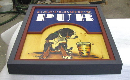
At our first onsite meeting with Win, we agreed to fabricate this sign similarly to the one we fabricated for the Gate House base lodge two years earlier. The new blade sign would feature a “knotty pine” face fabricated from HDU, and the same framing and colors as the Gate House Lodge sign. We also decided, in keeping with the desired atmosphere, the sign’s bracket should feature intricate metalwork.
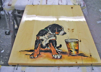
Jenn recalled that Win’s puppy, Rumble, a Bernese mountain dog, is named after one of Castlerock’s ski runs. He introduced Rumble to us – the dog had a great disposition, and I promptly photographed him in several poses. I rendered several rough sketches to scale, while we were gathered, to make sure the concept and location received client approval.
Advertisement
I’ve learned that rough sketches offer an efficient and instantly gratifying design tool. A three-minute sketch aptly conveys the intent and lets all parties feel comfortable about proceeding with the concept.
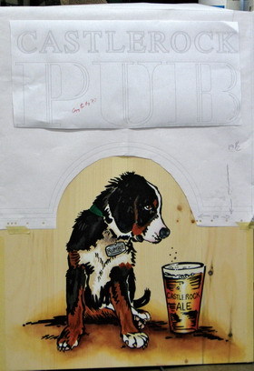
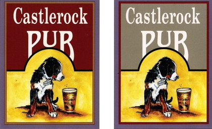
Jenn and I reviewed Rumble’s photos as I developed sketches for two options. I created rough sketches and color renderings by hand to make sure each concept evolved enough for Winn’s team to make an informed decision. We also explored 10 or more font combinations before Jenn settled on a version.
A poorly designed sign can sink any establishment, but a pub, which depends so much upon atmosphere, is especially vulnerable. She deserves credit for her input; she selected blue, which provides substantial visual impact.
Next, I created a full-size pen pattern, which we produced on our Graphtec cutting plotter and brought to the site to place in the sign’s anticipated position. I believe this part of my process prevents any misjudgments about a sign’s appropriate size.
Built to last
Advertisement
We tested full-size mockups to select materials and colors. For the substrate, Dick Lane and Erik Joslin, our primary fabricators, selected local pine with sufficient knots for authenticity, but not too many, which would impede fabrication. They laminated the selected boards with West Systems’ two-part epoxy.
Jessica Millard, one of our resident artists and a “dog whisperer,” has a special talent for painting animals. She used a pine scrap to test painting techniques we’d used on paper for the scaled-down renderings. On the wood at full size, we avoided tight detail in favor of a loose sketching approach. Jessica wet the paint to expose the wood grain, which worked very well.
We vigorously debated the color of beer we would feature in the panel; a lighter color would appear camouflaged against varnished pine. We chose an India Pale Ale hue, which we accented with lots of shadows and black lines to make it easily recognizable. After all, this is a pub.
With art and working-drawing approvals in place, we moved into the next phase of fabrication which started with cutting the upper ½-in.-thick, Sign*Foam® high-density urethane (HDU) lettering slab. I added relief and shadow-line details, which I think provide an air of craftsmanship. This added difficulty for Dick and Erik because installing an HDU layer, above the laminated-pine base and within a mahogany frame, required allowing expansion and contraction within the moldings. To accommodate this, we added ½-in. “step-up” pieces on either side of the slab which we enveloped with the molding. These allow the materials to “breathe.”
We increased the mahogany frame’s height to accommodate taller and thicker moldings to allow a comfortable fit when attaching moldings to the frame. Because most pubs feature handpainted signs, we chose Benjamin Moore’s exterior-latex coating to impart authenticity.
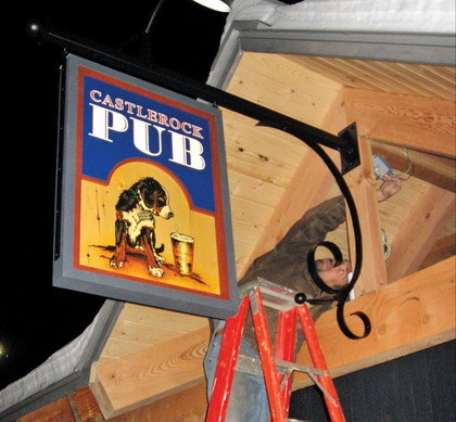
Poorly constructed blade signs present heavy liabilities. In this environment, winds up to 100 mph will slam into the panel. Therefore, we took extra time engineering it. We collaborated with Jason and his contractors to review installation solutions for attaching the sign to the gable’s support beam.
A post-and-beam method builds a strong vertical post. To combat the wind load, we heavily reinforced the bracket. To fit the gable’s extending roof, we extended the metal bracket approximately 3 ft. away from the building to hang the sign.
Our 2.5 x 3-ft. sign weighs almost 45 lbs. We built such a heavy sign to provide sufficient bulk to withstand heavy winds. Given its weight, factored with the sign extending 6 ft. from the building and two gooseneck lights added to the load, our engineering skills were tested.
However, the opportunity to create an ornate metal bracket rated as a silver lining to this challenge. Fortunately, we live near a superb metal fabricator. Fred Spencer, owner of Mountainview Ironworks, designed and engineered these steel brackets, which Vermont Ware powdercoated. Our senior designer and draftsman, George Dunne, coordinated with all the players to develop fasteners and electrical-hookup solutions. Luckily, we created a bolt-through electrical connection to the post, which provides the most security for blade signs.
As we assembled the components, we gained confidence in our plan. Erik and Joe handled a seamless installation that delighted the Sugarbush team. Hence, Jenn transformed our logo into newspaper ads, T-shirts and, most importantly, beer mugs. Once again, I marveled at the fun and satisfaction an effective sign collaboration can yield.
Equipment and Materials
Substrates: Laminated pine boards, from Lathrop’s Maple Products (Bristol, VT), (802) 453-2897; ½-in.-thick ,18-lb. Sign*Foam® HDU, from Sign Arts Products (Laguna Hills, CA), (800) 338-4030 or www.signfoam.com; mahogany frame and molding, from North Pacific Lumber Supply (Portland, OR), (503) 723-5410 or www.northpacific.com
Coatings: Exterior latex paint, from Benjamin Moore, available at hardware, home-improvement and paint stores; Liquitex artists’ acrylics and Epiphane varnish, from Jamestown Distributors, (800) 497-0010 or www.jamestowndistributors.com; Metal powdercoating, from Vermont Ware (St. George, VT), (877) 488-9273 or www.vermontware.com
Adhesives: Lexel silicone caulk, from Sashco Inc. (Brighton, CO), (800) 469-9094 or www.sashco.com; two-part epoxy, from West System Inc. (Bay City, MI), (866) 937-8797 or www.westsystem.com
Hardware: Custom steel brackets, by Mountainview Industries (Waitsfield, VT), (802) 496-2426; gooseneck fixtures, from Barre Electric and Lighting Supply (Barre, VT), (802) 476-0280 or www.barreelectric.com
More About Sparky
Sparky Potter, the proprietor of Wood & Wood Sign Systems Inc. (Waitsfield, VT), has operated his 10-employee company with his wife, Peggy, since 1972. Wood & Wood designs and fabricates signs, 3-D artwork, display systems, menuboards, storefronts and custom light fixtures. The company has earned numerous awards in ST’s International Sign Contests.


 Tip Sheet1 week ago
 Ask Signs of the Times3 days ago
 Photo Gallery1 day ago
 Real Deal1 week ago
 Benchmarks6 days ago
 Editor's Note2 weeks ago
 Women in Signs1 week ago
 Photo Gallery1 week ago