We’re proud to present our 3rd Annual Readers’ Choice Awards. As with the first two editions, we gleaned 10 nominees each for separate Electric and Non-Electric surveys by selecting high scorers from the judges’ initial scoresheets. However, the judges subsequently debated the winners to determine category winners and the Best of Show. Thus, these scoresheets were no rubber stamp for the outcome, and Readers’ Choice nominees diverge somewhat from the Sign Contest winners’ circle.
The response was tremendous. Last year’s competition attracted 7,744 votes. I’m proud to announce that this year’s survey’s more than doubled last year’s participation; 17,745 tallies were recorded through our www.surveymonkey.com polls, with 13,531 recorded for the Championship Round competition – which included six finalists, the top three vote-earners from the Electric and Non-Electric surveys – alone. We’re gratified the Readers’ Choice Surveys generated such interest.
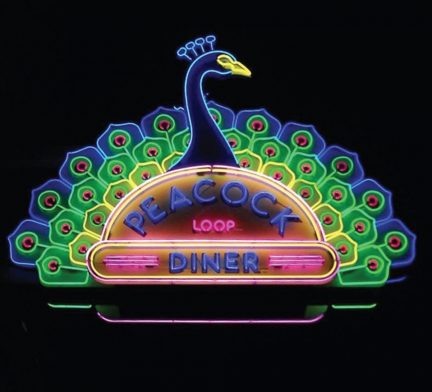
Determining the winner over the seven days of polling resembled a horse race; the two top-performing contenders, Creative Sign Designs’ Tradition Medical Center illuminated-monument sign and Piros Signs’ Peacock Loop Diner exposed-neon sign, playing nip-and-tuck for the top spot. Finally, by a 122-vote margin (each received more than 5,500 votes), Piros prevailed. Congratulations to Piros, and a tip of the cap to Creative Sign Designs for its strong showing.
Hope Edwards designed in collaboration with Kiku Obata and Co., a St. Louis-based, environmental-graphic-design firm, to design the Peacock Loop Diner sign, which spans 11 ft. wide, weighs approximately 1,800 lbs. and features more than 680 linear ft. of neon. Joe Edwards, Hope’s father and the Peacock Loop Diner’s owner, initiated the idea.
Describing the sign, Hope wrote, "A brilliant-blue peacock’s head and neck in profile rise above three rows of extravagant, fan-shaped tail feathers that light up and fan out in sequence around the test, which are, in turn, flanked by three, classic, diner stripes. The light sequencing shows a peacock spreading out its feathers and bringing them back on a dazzling display. Three rows of plumage are vividly colored in emerald-green, lemon-yellow and electric-blue neon. Each feather pops with a raspberry-colored eye spot. The sign looks colorful and beautiful during the day as well, with striking colors painted on aluminum. It’s a sign not only for the diner, but for the area and region. It showcases the vibrancy, color and friendliness of the Loop neighborhood and St. Louis."
Other finalists included Western Neon’s The Octopus Bar neon wall sign, Palmer Signs’ Buccaneer Bay post-and-panel sign, Brad Hominick’s Nipigon monument sign and Design Communications Ltd.’s Summit Bechtel Reserve sign system.
Advertisement
As usual, voters left several thoughtful – or provocative – remarks about their choices. A sampling:
“If I had to pick between saving my cat in a fire, or getting one night to have [the Octopus Bar sign’s] illuminating glow entrench my body with warmth, I’d pick the sign.”
“The Peacock diner is a fairly new St. Louis establishment, but one I hold very dear to my heart. The time I’ve spent here with some of the closest people to me is something I will never forget. I love seeing that neon sign because it brings me back to those times.”
“Tradition Center for Innovation, hands down, gets my vote. Futuristic with a great blend of neon, atomic symbol plus Florida’s silhouette. Love it!!!”
“I was very impressed with the Peacock Diner sign. It’s a delicate piece that unites the old and the current time while transmitting a clear message and a delightful sense of elegance. Congratulations to the designer and the manufacturer.”
“I’ve seen the Nipigon sign up close. It’s a beautiful sign, and suits the location perfectly.”
Advertisement
“The sign for the Tradition Center for Innovation is definitely the best. Love the use of color and shape. Even the surrounding landscaping adds something to the overall branding. Great work.”


 Business Management1 week ago
 Women in Signs1 week ago
 True Tales2 weeks ago
 Editor's Note5 days ago
 Maggie Harlow2 weeks ago
 Line Time1 week ago
 Product Buying + Technology7 days ago
 News2 weeks ago