What constitutes an attractive sign? For most of us, aesthetics are purely visual. We think of color, visual harmony with the architecture, well-chosen typestyles, custom-spaced characters and attractive materials with polished surfaces and edges. We don't consider sound or touch.
Sometimes, designers forget that signs are more than decorative items, that their main purpose is to identify and direct. Yet even if they adhere to these principles, the guiding force for the design remains its visual aspects.
Does that mean those who can't see must do without beauty? Music immediately comes to mind, but what about touch? Perhaps we haven't thought about how signs feel. This definitely brings a new dimension to the definition of a well-crafted sign. ("Talking" signs may one day become prevalent, but that's another chapter.)
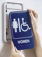
The arrangement of a sign's tactile elements greatly affects the text's readability. When braille is crowded against raised text or a border, it can be impossible to read. When tactile characters are touching, the reader doesn't know whether or not an enclosed space is within a character or between two characters. Tactile elements need to be arranged in a certain order for optimum meaning. For example, tactile characters in the upper-left quadrant of a sign, when paired with braille in the lower-right quadrant, lose all sense of a relationship for the tactile "viewer."
Small details can make the difference between an adequate and a truly wonderful visual sign system. Highly polished edges, well-shaped letters, harmonious typefaces and appropriate colors are the hallmark of the true signcrafter. No sign code requires this attention to detail. Instead, these ideals are pursued by those who take pride in creating high-quality products.
Why then, should we be any less careful about the elements of a tactile sign system? Yes, a good braille reader might be able to read cylindrical dots with flat tops and straight sides. But just as there are high-quality letter forms and aesthetic differences, so too does this hold true for braille.
Advertisement
Characters with sharp edges may look fine, but they don't feel fine. As visual readers, we don't want our eyes to get "hung up" on ugly letters or inconsistent spacing; nor do tactile readers want to snag their fingers while gliding over the words in a sign.
Intercharacter spacing needs to be considered also. In print and advertising, which are media designed for easy visual reading, letters are normally tightly spaced. The practice of tightly spacing letters has somewhat spread to signs, even though it may be less appropriate for signs that will be viewed from a distance. But our eyes are accustomed to tight spacing, and we tend to view any added space between letters as unaesthetic.
Conversely, tactile letters require added space if they are to be read. Ideally, a raised character should be slightly wider at the base than the top, which creates the illusion of a bolder character with tight spacing. Simultaneously, it provides the thinner profile and extra space that the tactile reader desires.
If straight sides are still necessary, then the spacing must be loosened. We will grow accustomed to it when it becomes more common. This greater spacing also will benefit older people whose eyesight has begun deteriorating.
With tactile signs, as with visual signs, good form tends to follow good function. Signs that are the easiest to read often seem to be the most attractive. If you wouldn't accept a sign with unpolished edges, then you shouldn't accept a sign whose braille isn't dome-shaped. That said, here are some ideas for more aesthetic signage.
Tactile character guidelines
Advertisement
Typestyles
• Letterforms retain their original characteristics; they're not exaggerated.
• Serifs, if used at all, are brief.
• Strokes are fairly uniform throughout, and more slender than bold.
• Characters seldom have breaks; they are neither condensed nor extended.
Spacing
Advertisement
• There is no doubt where one character ends and the next one begins.
• No two raised elements (braille, characters, symbols, borders or frames) are so close as to impede reading.
Layout
• Braille placement assumes left-to-right reading and directly translates the text.
• Layout remains as consistent as possible throughout the entire wayfinding system.
• Ideally, the braille message is situated flush left or centered under the corresponding text.
Braille
• The braille dots are domed or rounded in shape.
• Each dot is distinct.
• The dot height, size and spacing conforms to an accepted braille standard.
Non-tactile sign elements
Contrast
• The text and background of a sign should greatly contrast with very light and very dark colors. Subtle color contrasts may be used elsewhere on the sign.
Glare
• For a sign's text area, use matte surfaces that reflect as little light as possible; polished metals and other shiny materials may be used away from the text.
Character height
• The size of non-tactile characters should reflect the distance from which the sign will be viewed.
Pictograms
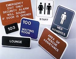
• Pictograms that identify or direct people to accessible elements should be sized, colored and located as to be easily seen from a reasonable distance.
Remember: Signs are entertainment, company identity, marketing devices and advertisements. The sky is the limit. Be playful; be elegant. Use any colors, shapes, surfaces or typestyles you see fit. Just make sure that the vital identification and information are presented in an accessible format, or in a separate section of the sign.


 Tip Sheet1 week ago
 Photo Gallery2 days ago
 Ask Signs of the Times4 days ago
 Real Deal1 week ago
 Benchmarks7 days ago
 Women in Signs1 week ago

 Photo Gallery1 week ago
 Women in Signs1 week ago
