"Electricity. It is a great power. Electricity is all around us, silently performing tasks we take for granted."
—Alexander Prokofief, designer and architect
Few people get the chance to work on a colossal project that melds architecture, signage, engineering, national symbolism and elemental forces. But designer and architect Alexander Prokofief (see ST , October 1999, page 116) immediately accepted the invitation of Vyacheslav "Slava" Obukhov, principal of Neon Graphics, a Togliatti, Russia-based sign company, to design and help coordinate fabrication of a symbol and new signage for the Zhigulevskaya hydro-electric power station on the fabled Volga River.
Prokofief said, "Slava had worked with me on many projects in Russia and the United States. When his company took part in the prestigious limited competition on this project in December 2004, Slava immediately invited me to participate as a lead architect. Even though I was very busy with other projects, I immediately accepted the offer. Thanks to the Internet, the distance separating us wasn't really a great obstacle."
Prokofief served as the project's lead architect and main design and fabrication coordinator. He graduated from the St. Petersburg State University of Architecture and Civil Engineering as an architect and joined the Russian Union of Architects ("the Russian equivalent of the American Institute of Architects") in 1985, and the Russian Union of Artists in 1991. He came to the United States in 1992, and, since 1994, has worked as a lead architect and designer for American Sign-crafters (Bayshore, NY), a major player in the sign industry.
Advertisement
The longest (2,300 miles) European river, "Mother Volga," serves as Russia's chief thoroughfare. It carries half the country's river freight and irrigates the steppes (the grasslands in the lower Volga region). Originating in the extensive marshes of the Valdai Hills, 740 ft. above sea level northwest of Moscow, the Volga heads east towards Kazan, turns south and flows past Togliatti, Samara and Volgograd (formerly Stalingrad), and discharges into the Caspian Sea below Astrakan at 92.4 ft. below sea level.
Numerous dams and hydroelectric power stations have been constructed along the river. Also, the country has restructured the power-utility sector to replace the regulated, state-owned monopoly enterprises with deregulated, privately owned enterprises, such as this power company.
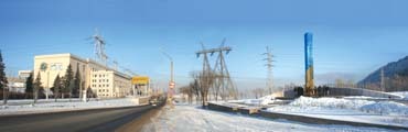
This project entailed creating a symbol to identify the station (one of the largest on the river), commemorating its 50 years of service and drawing attention to it from the M5/Moscow-Ural highway.
Steppe by step
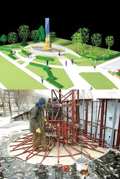
Prokofief provided the concept for the station's main entrance, the work plans, technical documentation and a mock-up for the site and monument. At the initial stage, he coordinated the unified landscaping system, building illumination, the logo placement on the main building and such functional issues as parking, bus stops for visitors and municipal transportation.
Advertisement
To conceptualize such a vast project, Prokofief tapped nature's forces – and the colossal energy system. The client, Russia's Unified Energy System, generates 650 billion kW of electricity annually and employs almost 600,000 workers. Electricity, Prokofief said, represents unity and power to the people.
"Communism was presented as the Kingdom of Heaven on Earth, which was Soviet power [Justice] plus electricity [Light/Enlightenment]. Now, a mass religious revival is happening in Russia. Christianity is replacing communism as an official ideology, but 'electricity for all' still remains a necessary ingredient of the 'coming' Kingdom," he said.
In January 2005, Prokofief finished the first sketches, which, after Slava's approval, formed the backbone of a more detailed and realistic rendering. Neon Graphics incorporated the rendering, plus a detailed site plan, into the final bid package.
Having won the first competition level, the project proceeded to the client's Moscow headquarters. To save time, and in anticipation of winning the bid, Prokofief worked on a two-part mock-up, which comprised a 1:200-scale model that detailed the architectural plan, and a 1:50-scale model that displayed the structures. In March 2005, the team received final approval, and, after a few plan corrections, the contract was written.
The team spent from April to June working on such preliminaries as working documentation, 3-D animations and modeling. Prokofief said he communicated with the Neon Graphics team through the Internet and phone while they smoothed out engineering calculations, completed shop drawings and secured client approvals.
Advertisement
Prokofief said, "The only real problem in our virtual communication was that I couldn't feel the texture of the materials. Other than that, digital photos gave me a pretty good representation of the materials and colors."
Numerous changes and remakes forced Prokofief to complete, in Russia, the aluminum-framed, Plexiglas® acrylic/metal/vinyl mock-up in July. The parts were manufactured, assembled and transported from September to November, and the project was completed in December 2005.
Materials came from local sources and Moscow supply-company imports, but 95% of the project comprised custom-made, pre-fabricated units.
"There was no shortage of quantity or quality of choices," Prokofief said. "Most of the unusual materials and components, such as Alucobond® stainless steel with a special coating, special surfaces for low temperatures, landscape lanterns and certain unique fabrication equipment, were ordered from Moscow supply companies. It also helped that the location was in the vicinity of Togliatti, the largest industrial city on the Volga River [we call it the Russian Detroit]."
Russian sign materials simulate their American counterparts, differing only in specific characteristics. However, availability may be limited, and delivery may be problematic. Certain adhesives and bonding polymers for the cold-junction of metals and plastics aren't used in Russia and must be ordered directly from the United States.
However, color-coated stainless steel and affordable 3-D machining technology (which was used to produce the fiberglass shapes) were easily procured.
Landscaping incorporated local materials, such as concrete, sand, gravel, granite (for the cladding) and road-block steps.
Subcontractors were selected through a competitive bidding process, which was advertised in the media and Internet catalogs.
Elements
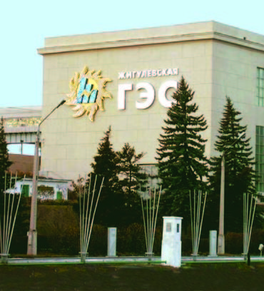
The letters in front of the main sculpture, which symbolizes the dam, spell out the company name, Zhigulevskaya Hydro-electric Station. The 20-in.-tall, stainless-steel letters are mounted with 10mm pins, which are supported with aluminum-tubing spacers. Sikkens (Sassenheim, the Netherlands) 319/6 "gold" enamel forms a protective coat. External lanterns illuminate the letters.
Described by Prokofief as the "tower of power, which symbolizes the power of the Volga River, the flow of energy and the transformation of water into energy," the dam-symbol foundation comprises reinforced concrete with polished and matte granite on top. The metallic frame and aluminum panels were coated with a tri-tone, aluminum paint made by Tikkurilla (Vantaa, Finland). Square, aluminum tubes were coated with Sikkens gold enamel and welded into a "cascade." The vertical monument comprises a steel frame and stainless-steel panels with a blue, nitride-titanium coating.
The 25-ft.-high x 28-ft.-wide x 18-in.-deep energy emblem sits 42 ft. high on the side of the building. Its solar theme connotes supreme power. "We are capable of 'creating the Light' on a truly grand scale," Slava said. "Never before has humanity had so much power over nature."
The emblem frame comprises square steel, 2 3⁄8 1-in. x 1 1/4 and 1 1/4 x 1 1/4-in. tubing and 3⁄16-in.-thick Dibond® with a brushed gold surface. Blue and gold nitride titanium coats the .031-in. stainless tell stripes.
The blue, double-halo lighting incorporates "Superblue" neon from Tecnolux (Italy), and the exposed, yellow neon uses Tecnolux' "Pineapple."
The entire structure, divided into 11 units to facilitate transportation, was assembled onsite prior to installation. A 40-ton crane with a 115-ft. arm hoisted the piece, which was installed with six metal brackets and attached through the wall with 1-in.-diameter pins.
The channel letters, which spell the company name and an abbreviation for "hydro-electric station," are halo-lit by argon and K4 (typically a 75% neon and 25% argon mix, which endures cold climates) in 15mm Tecnolux tubing. Thirteen F.A.R.T. (Treviso, Italy) transformers power the emblem (seven for the abbreviation and six for the name). The transformers are mounted on the wall inside the building.
Electrical requirements are regulated by "The Rules of Making Electrical Installations," which is issued by the state. Prokofief said transformers used in Russia have built-in protection against surges and short circuits. Grounding is mandatory. Incoming voltage is 220V, and frequency is 50Hz.
For this project, the team obtained a general license for work involving construction at high elevations. Licensed specialists handled montages and electrical work.
"We had to observe safety rules and have all documentation and permits at hand," Slava said.
Such huge projects as this are typically handled by firms, which are licensed. The station's chief engineer inspected and approved the project.
Prokofief said his designs fulfilled not only the client's demands, but also a spiritual quest. "It became like a prayer, like building a shrine. Today, after the work is finished, I look at this monument, and I feel it has a soul of its own. Being inside the station fills you with almost religious awe. Plus, this station is located in the heart of Russia, on a great Russian river, Mother Russia, and has been historically treated with the greatest reverence."


 Tip Sheet2 weeks ago
 Photo Gallery3 days ago
 Ask Signs of the Times5 days ago
 Real Deal2 weeks ago

 Benchmarks1 week ago

 Women in Signs2 weeks ago