Connect with us

Digital Printing

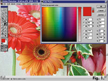
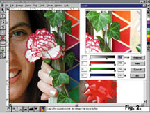
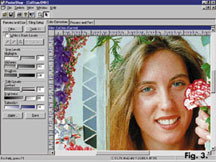
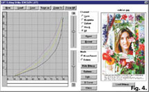
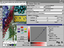
Color Calibration for Digital Printers

Tips plus a test image for improving results

Published

on

Suppose you own a digital print machine. Suppose an enlightened client specifies a "just out" ink — one of the new UV-resistant or waterproof brews — for his project. Suppose, further, that you agree to use these inks. After all, once you flush the system, it’s merely the task of loading the new ink bottles. Suppose, once loaded, you run a test print. Poor color results? Welcome to large-format color digital imaging.

Here is another caution: Unless your facility has climate controls, the identical combination of ink and substrate may require one color table for winter conditions and another for summer conditions. Therefore, I think it’s important to establish your own benchmarks.

Should you run up against new inks, substrates or other changes, rest easy; color calibration is far easier than eating brussel sprouts. You can learn some straightforward ways to measure, calibrate and refine the output from your printer.

Of course, once you’ve done the work — calibrated new color tables for new inks or substrates — how do you know the change is correct? You can print the client’s image — but if it’s on a disk, how do you really know what is correct? In real life, users test by printing a standard, familiar image and comparing it to earlier prints as well as their own opinion.

The project

I designed this month’s project as a 6 x 10-in. image to help you map different aspects of your printer’s performance. My test image fits onto a floppy disk and expands to about 13 Mb. I purposefully made it small, but you can print it at poster size for closer study. I’ve titled the test image "colstan.jpg," where "colstan" means color standard. The JPG tag actually means Joint Photographic Experts Group (JPEG). This is a popular file-compression scheme. It provides ratios of up to 100:1 and loses sharpness as the compression ratio ascends (+20:1). Major sign-making programs usually accept JPEG files.

Advertisement

RGB vs. CMYK colors

The main reason for the very existence of the red, green, blue (RGB) and cyan, magenta, yellow, black (CMYK) gamuts is that they are effective means to blend colored dots for our eyes to see as various colors. Seurat, the 18th-century pointillist, started it all by applying primary color dots to his canvases, which, when viewed from a distance, became vivid full-color images. Newspapers and Dell

Advertisement

SPONSORED VIDEO

Introducing the Sign Industry Podcast

The Sign Industry Podcast is a platform for every sign person out there — from the old-timers who bent neon and hand-lettered boats to those venturing into new technologies — we want to get their stories out for everyone to hear. Come join us and listen to stories, learn tricks or techniques, and get insights of what’s to come. We are the world’s second oldest profession. The folks who started the world’s oldest profession needed a sign.

Promoted Headlines

Advertisement

Subscribe

Advertisement

Most Popular