You might not remember the Five Man Electrical Band, but the group’s flash-in-the-pan hit "Signs" is the best-known musical reference to my favorite subject. In the song, one sign discourages people with certain hairstyles from applying for employment. In a similar vein, those who don’t grasp legibility’s critical role in a sign’s selling power scarcely belong among the ranks of sign professionals. In this age of computer-aided design, bad graphic layout is particularly inexcusable.
Poor design frequently illustrates the politically incorrect truth that the customer isn’t always right. Some customers assume that, in terms of a sign’s message, more is better. Equally dangerous are customers with the temperaments, but not the talents of graphic designers. As a sign professional, perhaps the most ominous question you can be asked by your client is, "How many words can I fit on a 4-by-8-foot sign?"
Legibility 101
Although many factors combine to produce effective signage, here’s the Nuts and Bolts checklist:
1) The sign face(s) must be large enough for the proposed copy and mounting location.
2) Restrict the sign’s message to essential information.
3) Employ legible font styles.
4) Incorporate an effective, contrasting color scheme.
5) Locate the sign to facilitate unobstructed viewing from streets, roads or other thoroughfares.
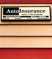
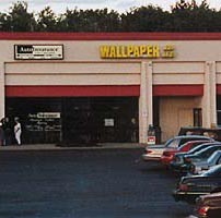
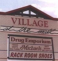
For example, if your customer’s store is located in a strip shopping center and his budget only permits a 2-by-8-foot sign, try to discourage the client from including too much copy (Figs. 1 and 2). A sign of approximately the same size displaying only the business name with good color contrast is much more effective. Fifteen minutes of fame might be acceptable for TV, but for the signage medium, that’s an eternity. Unless passing motorists can identify your customer’s store within 2-3 seconds, the sign isn’t doing its job. If the business owner is smart enough to choose a name ("Affordable Floors" for example) that tells the public what he’s selling, and the name is clearly visible, additional information isn’t necessary or desirable for a small sign.
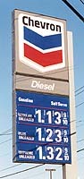
If the size of your client’s sign is minimized either by the budget or by City Hall, the font style’s legibility is particularly critical. A smaller sign that incorporates artsy letter styles is virtually invisible from an effective viewing distance (Figs. 3 and 4). Regardless of the sign’s price, it’s a wasted investment. Poor color selection and the inclusion of superfluous "gingerbread" can also render signs useless (Fig. 5). If local sign codes are too restrictive, municipalities clearly penalize business owners by denying them the right to have effective advertising. Even where larger formats are permitted, however, excessive copy, florid fonts and bad colors can negate a sign’s promotional ability.
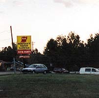
Whimsical styles are quite popular in art and design, but whimsy can be fatal in the sign world (Fig. 6). Far too many signs today contain copy that resembles the scribbling of preschool children or your family doctor. The true genius of award-winning sign design is measured by the degree of creativity designers can express within the boundaries of good legibility.
To get a handle on color visibility, you can either go by the book or take a field trip. The Sign User’s Guide: A Marketing Aid by James and Karen Claus gives a ranking of the 16 most legible color combinations (Fig. 7). Examining the signs of America’s most successful corporations (Fig. 8), we find that patriotic colors are clearly the most popular. It’s no accident that Old Glory looks great flying in the breeze, because our national colors are among the most effective in combination. In addition to ordinary black-on-white, however, yellow and black combinations reign supreme in the color-visibility game (Fig. 9). Not far down the list, we find white-on-blue and yellow-on-blue (Fig. 10). Green is also a highly effective color when contrasted with white.
Conversely, colors like purple, pink, turquoise and fuchsia are usually ineffective, particularly for backlit sign graphics. Lack of contrast is typically the culprit in a poor color design. You can’t put a light pastel color on a white background and expect the message to show up. Similarly, the effect of dark copy on a dull-colored background is forbidding. Probably the worst color scheme I’ve ever seen was employed on a continuous illuminated awning at a strip shopping center in Florida. The background was pink and the copy was black. When this $50,000 awning was illuminated at night, the predominant feeling was akin to Hunter S. Thompson’s "fear and loathing." With colors, as with font styles, the notion to be cute is usually a bad idea.
Logo logic
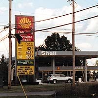
Using logos to accentuate a sign’s message can be highly effective. In some cases, the logo carries such powerful brand identity that no message is necessary. Some well-known examples of this are McDonald’s golden arches and Shell Oil’s seashell identification signs. Other national advertisers like Exxon Co., USA and Mobil Oil employ stylized lettering (X’s and O’s) to distinguish their images. Typically, the font styles used by national restaurant franchises reinforce specific themes. In many cases, the fonts are created specifically for the customer.
Novice sign designers can learn a lot by studying national franchise signage. Probably the most important lesson is never sacrifice visibility, regardless of the client’s desired theme. Helvetica Medium lettering was once so common for signage that people made jokes about it. But after you’ve struggled to discern some avant-garde lettering styles, it’s easy to understand why sign companies continue to rely on the most legible fonts.
Just the facts
Many small-business owners insist on including their business phone number, their name and other accessory information on their signs. But if this information is so critical, why don’t the national-franchise signs include it? When is the last time you drove past a fast-food restaurant or gas station that displayed its phone number? Perhaps a better question might be: How many motorists are quick enough to write down a phone number as they drive by a store at 45-60 miles per hour? Also, most people don’t care who manages the store, how long it has been in business, or whether it claims to have "lowest prices." What consumers do care about is whether the store sells something they need.
Advise your customers not to waste valuable space on information that is lost or disregarded. The fundamental purpose of an on-premise sign is to identify the business type within 2-3 seconds. The sign(s) should enable passersby to distinguish a tire store from a carpet store almost instantaneously. Even the best graphics styling fails if the sign doesn’t meet these ground rules. After ensuring that the basic identification need is satisfied, the sign designer can be as creative as he or she wishes.
Hide and seek
You’ve done your homework and designed a sign that reaches out and grabs attention. But if you locate the sign near a spreading maple tree or 60 feet behind the front property line, who is going to see it? This sounds like a no-brainer, but it’s surprising how many sign companies allow municipal authorities or customers to dictate sign placements without lobbying for more visible locations.
In this respect, the best interests of the sign company and the customer converge. When your company designs and builds an attractive, effective sign, your stake in visibility is equal to your client’s interest. Select a mounting location that affords maximum legibility according to the sign’s size. A common error is to install small- or medium-sized signs too high on poles or buildings. Unless the lettering size is very large, such signs are not legible. As a general rule, all signs mounted at heights exceeding 35 feet should contain copy limited strictly to essential information.
Unfortunately, driving up and down the same street searching for a certain retail business is a common experience today. When Signs of the Time’s staff attended the ISA National Fall Sign Expo ’98 in Anaheim, CA, a show attendee recommended a local restaurant. This anonymous eatery is apparently one of the area’s best, and the owner obviously spent a considerable sum of money on the large, pole-mounted cabinet sign. Unfortunately, the sign incorporates a highly stylized script-lettering style with assorted graphic flourishes. The name is impossible to read, and the copy resembles spaghetti on black velvet. Our group almost missed the restaurant despite its excellent location and reputation.
This type of sign reflects the continuing presence of sign companies, sign users and municipalities that ignore the raison d’être of signage. As a sign professional, it’s important to be part of the vanguard that alleviates poor design. Most customers and city planners simply don’t know enough about graphics to be trusted in the driver’s seat. But the sign professional can hardly tout the economic value of signs unless he is designing signage that works.


 Tip Sheet1 week ago
 Ask Signs of the Times3 days ago
 Photo Gallery1 day ago
 Real Deal1 week ago
 Benchmarks6 days ago
 Editor's Note2 weeks ago
 Women in Signs1 week ago
 Photo Gallery1 week ago