Business Management
ARTfx Signs Helps Pies and Pints Shine in Brass City
Signage at Waterbury, CT restaurant reflects city’s manufacturing heritage
Published
8 years agoon
Lawrin Rosen is founder and president of ARTfx Signs (Bloomfield, CT).
EQUIPMENT AND MATERIALS
Lighting: Custom LED fixtures, built in-house; LED lamps, from commercial electrical suppliers; Gooseneck lighting fixtures, built with an Ercolina tube bender, from CML USA (Davenport, IA), (563) 391-7700 or www.ercolina-usa.com
Router: Sabre 408 CNC router, from Gerber Scientific Products (Tolland, CT), (800) 222-7446 or www.gspinc.com
Software: CorelDraw® X7 software, from Corel Corp. (Ottawa, ON, Canada); Photoshop® software, from Adobe Corp. (San Jose, CA), www.adobe.com
Substrates: Aluminum 0.063- and 0.125-in.-thick sheets, from such suppliers as Southern Aluminum Finishing (Atlanta), (404) 355-1560 or www.saf.com; Half-in.-thick acrylic, from such suppliers as Sabic Polymershapes (Pittsfield, MA), (413) 448-7110 or www.sabic-ip.com
Welding: Miller Weldmaster 350P MIG welder, from Miller Elec. Mfg. Co. (Appleton, WI), (920) 734-9821 or www.millerwelds.com
After four decades of designing signs, awnings and related architectural accessories – and spending too many of those years chasing inspiration – I’ve concluded that some of the best design opportunities present themselves on a silver platter. In other words, one should first examine the obvious. Such was the case when our shop developed the sign, awning and lighting package for Pies & Pints’ flagship Waterbury, CT location.
Connecting signs and architecture
Years ago, someone in our trade (and I apologize to them if they’re reading this) pulled a couple of oversized waterfall awnings from a stock-photography collection and plunked them on the future site of this restaurant and brewery. This was a careless design decision, especially for a significant architectural masterwork such as this early Arts and Crafts-style brick, limestone and mahogany building from the late 19th Century. It’s criminal for an environmental-graphic designer to ignore a building’s architecture.
Beginning with the Industrial Revolution and continuing through the 1970’s, Waterbury, which is home to about 110,000 people, was the center of the world’s brass industry and is therefore known as the Brass City. For many years, the thriving little metropolis turned out belt buckles, buttons, pipe fittings, machine parts and mortar shells that were shipped near and far by the thousands. Over 2,000,000 sq. ft. of red-brick factories, which accommodated more than 10,000 workers, lined the Naugatuck River (Naugahyde was invented at the Uniroyal factory 10 miles downstream in 1936).
Today, the only reminders of Waterbury’s heyday include a rather unremarkable shopping complex known as the Brass City Mall and the few remaining brick stores and pubs once frequented by thousands of workers. When I first laid eyes upon the small edifice soon to become the Pies & Pints anchor location and brewery, I envisioned the workers of yesteryear pouring in for a pint or two, clanking glasses in good cheer. Part of my task was to appropriately honor that memory.
Design: man and machine
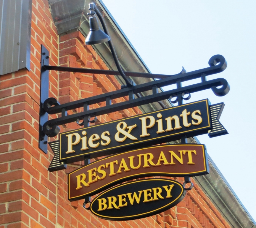
The owners requested awnings for protection from unpredictable New England weather. I suggested metal canopies that could also function as three-faceted signs and housings for sidewalk lighting. I decided a traditional projecting blade sign would enhance the establishment’s appeal.
Our first task was obvious: pull down the two ugly awnings in place, which obliterated the building’s lines, and take digital photos from all angles. From there, I sketched out the façade by tracing a photo with a felt-tipped pen and squared it with a standard drafting table arm. Immersed in the composition,
I quickly found my inspiration in the shapes of the arched window tops and divider moldings.
Once I had a basic, cohesive arrangement on a sketchpad, I shared it with the client for feedback and approval. Then, we brought our ideas to life using CorelDraw X7 software in combination with Adobe Photoshop. Many shops’ designers prefer Adobe Illustrator, but we rely on Corel. The program contains built-in dimensioning with multiple scales – an essential for architectural presentation. At ARTfx, we use Adobe Illustrator merely as a translation program between shop drawings and production files we send to our and Gerber Scientific Products CNC-routing equipment.
Generally, a building has one front entrance. However, this building has two because it was most likely built as a restaurant and pub with formal and informal entries. I’ve never been a proponent of two identical signs within viewing distance of one another. I tell clients it’s like saying “hello” twice. But, in this case, two entry signs were required, so I designed matching awnings and minimized the redundancy by creating different messages, “Restaurant’’ and ‘’Brewery,” on each.
Color scheming
When designing signs for installation on a red-brick building, be careful when choosing a primary background color. The deeper the building’s color, the fewer viable, complementary colors you have. In this case, I chose black because I know it looks good against red brick. Additionally, the darker the sign’s background color, the greater the quantity of choices for contrasting letter and graphic colors. Referencing Waterbury’s history, I selected a brassy, bright-yellow gold with ivory and terra cotta hues for graphic accents.
We built the awnings from aluminum: 0.125-in. sheet for the sides, which was MIG-welded to 0.063-in. material used for the top. Due to the upper arches’ strength, they didn’t require heavy structural work. Instead, we used a frame built from 1 x 1 x 0.125-in. aluminum tube. Around the lower perimeter, I specified a heavy molding, which contains wash lighting aimed upward to illuminate the 3-D letters, and downward to light the secondary message on the hanging panel and, to a lesser degree, the sidewalk.
The lighting’s the thing
In recent years, we’ve experimented with LED wash lighting, and have tried various linear-beam fixtures from SloanLED, Bitro and Allanson. With trial and error, we’ve had some successes, but continue to gauge critical factors, such as the vertical and horizontal distance of the lightsource from the subject matter. If wash lighting is too close to the surface being illuminated, the highlights and shadows dominate. On the flip side, if it’s too far away, the purpose is negated and hotpots will obliterate the intended, subtle, wall-washing blend.
For greater control, ARTfx frequently designs its own light fixtures. This involves varying module spacing, light intensity, diffusion levels and Kelvin temperatures – all while using stock LED components. If certain modules come from the factory pre-spaced at two modules per foot, we’ll often tighten the wiring and space them at three per foot to gain 50% greater luminosity. We have also shifted our stock toward warmer lighting hues. While many sign manufacturers consistently resort to 6500K white as their go-to modules, we tend to use 5000K as our mainstay, reducing needed into the 4500, 4000, 3500, 3000 and even 2700K range. It all depends on the purpose. For Pies & Pints, we used 3500K white to create a more traditional ambience.
The establishment’s projecting blade sign merges the awning shape with traditional, European-style tavern signage and employs standard spotlighting or flood lighting (depending on beam span). We bend our own goosenecks using an Ercolina pneumatic pipe roller and attach inexpensive fixture heads that can be found at any home improvement store. LED spotlighting can present challenges, such as beam’s viewing angle – the closer the distance to the subject, the greater the beam expansion required.
However, there are other variables, such as the bulb’s neck width. Any LED spotlight or floodlight bulb brighter than 65W (incandescent equivalent) has too thick a neck to fit into traditional spotlight domes. As a result, we purchase thinner neck, high power LED bulbs from electrical-supply houses. Besides the greater variety, we often receive much better deals than we’d receive at home-improvement stores. Additionally, rebates are commonly offered to contractors purchasing LED bulbs for commercial purposes.
Rounding out the tavern’s sign system, we also built a 13-in. x 12 ft. 5-in. horizontal, backlit cabinet sign above the restaurant’s less conspicuous third entry, which leads to its enclosed porch. It features a stencil-cut, 0.125-in. aluminum face with push-through, ½-in. acrylic letters. White, 3500K LEDs are set to a uniform color temperature throughout. (Unless dictated by the client or an apparent need, we tend to maintain consistent color temperatures throughout our signs.)
ARTfx provided signs and awnings for Pies & Pints to help bring patrons through the door. However, of equal importance, we strategically coordinated the look of our work with its architecture, which traces its roots to a great industrial era. I believe we’ve created signage that complements the history of a grand city that once stood at the core of American manufacturing.
More about Lawrin
Lawrin Rosen graduated from New Haven, CT’s Creative Arts Workshop and the Hartford (CT) Art School and holds a bachelor of fine arts degree in painting. He began his sign career painting geometric murals in private homes and creating signs for local businesses before joining a small New Haven signshop in the spring of 1978.
“Essentially, I swept, dug holes and painted white sign backgrounds with a roller,” Rosen said.
Eventually, he landed a job with Hartford’s Griese Outdoor Advertising. After a promotion to art director there, Rosen founded Art Effects (now spelled “ARTfx”) Signs on New Year’s Day 1983. He oversees the company’s design, marketing and sales of custom signage; Rosen proudly notes that ArtFX has won more than 250 awards in various sign-design competitions (including ST’s). For more information about the company, contact (860) 242-0031 or lawrin@artfxsigns.com.
SPONSORED VIDEO
Introducing the Sign Industry Podcast
The Sign Industry Podcast is a platform for every sign person out there — from the old-timers who bent neon and hand-lettered boats to those venturing into new technologies — we want to get their stories out for everyone to hear. Come join us and listen to stories, learn tricks or techniques, and get insights of what’s to come. We are the world’s second oldest profession. The folks who started the world’s oldest profession needed a sign.
You may like


Advertisement
Subscribe

Magazine
Get the most important news
and business ideas from Signsofthetimes Magazine.
Advertisement
Most Popular
-

 Business Management1 week ago
When Should Sign Companies Hire Salespeople or Fire Customers?
-

 Women in Signs1 week ago
2024 Women in Signs Award Winners Excel in Diverse Roles
-

 True Tales2 weeks ago
Sign Company Asked to Train Outside Installers
-

 Editor's Note6 days ago
Why We Still Need the Women in Signs Award
-

 Maggie Harlow2 weeks ago
The Surprising Value Complaints Bring to Your Sign Company
-

 Line Time1 week ago
One Less Thing to Do for Sign Customers
-

 Product Buying + Technology7 days ago
ADA Signs and More Uses for Engraving Machines
-
 News2 weeks ago
MUTOH Partners With Wasatch for RIP Software Package