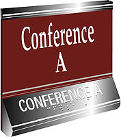
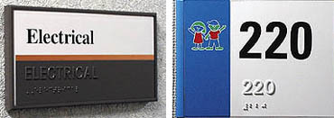
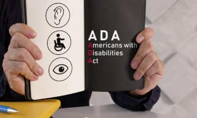
ADA signage attempts to satisfy many different people: those who are legally blind but have some sight, those who read Braille and those that do not. Through tactile, color-contrasting letters and Braille, ADA signage’s purpose is to direct and inform the visually impaired. However, ADA signage also has a second purpose, given that signmakers have to make a profit or no longer be signmakers. But keeping pace with the ever-evolving ADA guidelines can be confusing. Well before May 15, the deadline for comments on the proposed changes to ADA Accessibility Guidelines, signmakers re-evaluated the use of ADA and associated rules, and continue to do so. If these changes (see chart,below) to the guidelines are news to you, don’t worry. Sign-industry representatives, including the Intl. Sign Assn. and the Society for Environmental Graphic Design, reviewed the proposed laws and filed recommendations. Now, the U.S. Architectural and Transportation Barriers Compliance Board (commonly referred to as the Access Board) is reviewing all comments received. The board will publish a final rule and forward its document to the U.S. Department of Justice, which will pass the new guidelines into law, hopefully before 2002. ISA and SEGD suggestions In recommendations filed by Suzanne Beamer Bohnert, vice president of government relations and public affairs, the ISA commented on four basic areas: typeface and stroke thickness, character spacing, mounting height for tactile signs and Braille location. ISA also added its perspective on typography. "Signs are a one-way conversation between an organization and its prospects, customers and employees," states the ISA. "The message conveyed by a sign system goes beyond the literal message contained in the signs, but becomes part of the overall image of the organization." On the same topic, ISA stated, "Typography is a basic element in sign design. Even though highly decorative typefaces are not permitted for tactile signs, there is no such thing as a neutral typeface. Although many of the modern sans-serif faces lack adornment, they still carry inherent, if subtle, messages that influence perceptions of the organization they represent. They are called type ‘faces’ because they have inherent qualities that reflect their character." The proposed guidelines will greatly impact creators of etched-ADA signs, the ISA says. In etched-sign manufacturing, letter color is applied to the raised character’s face. The ISA writes: "Few of the most popular typestyles used in etching comply with the new restrictions to tactile character forms, and the restrictions for tactile characters are extreme: no serifs, very thin stroke width and wide mechanical spacing." The proposed standards, which require letters to have a very thin stroke and wide mechanical spacing, run contrary to good design practice and visual readability. Tactile signs may be engraved, which results in raised characters applied to the sign faces. ISA writes that this method may result in a more palatable tactile solution. "The characters can be cut at a bevel so that the top of the letter is thin for tactile reading, while the base is wider to facilitate visual reading." Ken Ethridge, AIA, corporate communications vice president of ASI Sign Systems (Dallas) and current American National Standards Institute (ANSI) committee member from the SEGD, says the design organization surveyed its members before focusing recommendations on five basic points: stroke thickness, character spacing, typeface requirements (for which the SEGD deleted all requirements), Braille position and requirements for symbols. "We came down hard for easy to read, easy to enforce legislation," he says. Research for tomorrow ISA is raising funds for further research to determine the correct blend of characteristics for signs that are both tactile and visual, but planning is still in prenatal stages. The association says it does not favor eliminating raised characters, but questions the usefulness of long, detailed tactile messages. Several people, including Ethridge and Sharon Toji, former ISA member of the ANSI committee and ST contributor do not believe the sort of research proposed is the answer to ADA problems. "Setting up a scientifically rigorous study on tactile characters is fraught with difficulty because of the many variables involved," Toji writes in the June 2000 edition of ADA Directions, published quarterly by Access Communications (Gardena, CA). "For instance, we could choose to study serif versus sans-serif typefaces, but everything else would have to be identical, and of course, there are many fonts in each category of type," she says. "Another problem would be the composition of the signs themselves. If we used real words and tested the same words in two different typefaces, readers would probably learn the word from the first reading and that would make it easier to read the second sign." For more information concerning the ADA Directions newsletter, call Sharon Toji, Access Communications at (310) 323-5210; e-mail: accesscomm@earthlink.net. The visually impaired comment James Gashel, director of governmental affairs for the National Federation of the Blind (Baltimore), says any sign or device that helps people navigate is welcomed, but most visually impaired people don’t feel strongly about the great detail in specifications concerning ADA signage. "To find a sign you have to feel around anyway," he says. However, Gashel says the requirements, especially those concerning Braille, are most effective near doorways and when indicating room numbers. Raise your voice For more information about the proposed regulations, contact Teresa Cox, ISA’s representative to the ANSI task force and APCO Graphics Inc. (Atlanta) president. You may reach Cox through the ISA at (703) 836-4012 or www.signs.org. Ethridge can be reached through the SEGD at (617) 577-8225 or www.segd.org.


 Tip Sheet1 week ago
 Ask Signs of the Times3 days ago
 Photo Gallery1 day ago
 Real Deal1 week ago
 Benchmarks6 days ago
 Editor's Note2 weeks ago
 Women in Signs1 week ago
 Photo Gallery1 week ago