Design
Ivan Chermayeff, Designer
Iconic designer Ivan Chermayeff recently passed away at age 85.
“…this hypothesis implies that art history should occupy a central place in virtually any study of human forms of life.”
– Whitney Davis
A General Theory of Visual Culture
One day in Aspen, CO, Ivan Chermayeff, graphic designer, founder of Chermayeff & Geismar & Haviv, and originator of numerous remarkable logos, revised my real-world education in graphic design. Chermayeff, addressing a group of designers at an Aspen Design Conference colloquium, said, “If the message is important, the font and design should be simple.” He added that a stop sign is a classic example. He said this plainly, unobtrusively, modestly voicing a concept that I soon found flickering in my head: A stop sign is a classic example of effective graphic design.
Although I keenly admired his work, I mentally disagreed with Chermayeff’s stop sign comment. I was a bit younger then, an art school inaugurate and the cool chief of a government design group. Hell, I knew everything. I knew to not mix serif fonts, that a graphic visual should have backdrop panels, and that Helvetica Light should never stand alone. Still, Chermayeff’s concept lingered. It rolled around my head like a flounced pinball, but soon notched in and lit up. I finally agreed. It’s true; if a graphic message is genuinely crucial, the visual delivery should be unadorned and easy to comprehend, which certainly makes a stop sign a first-rate prototype for effective design.
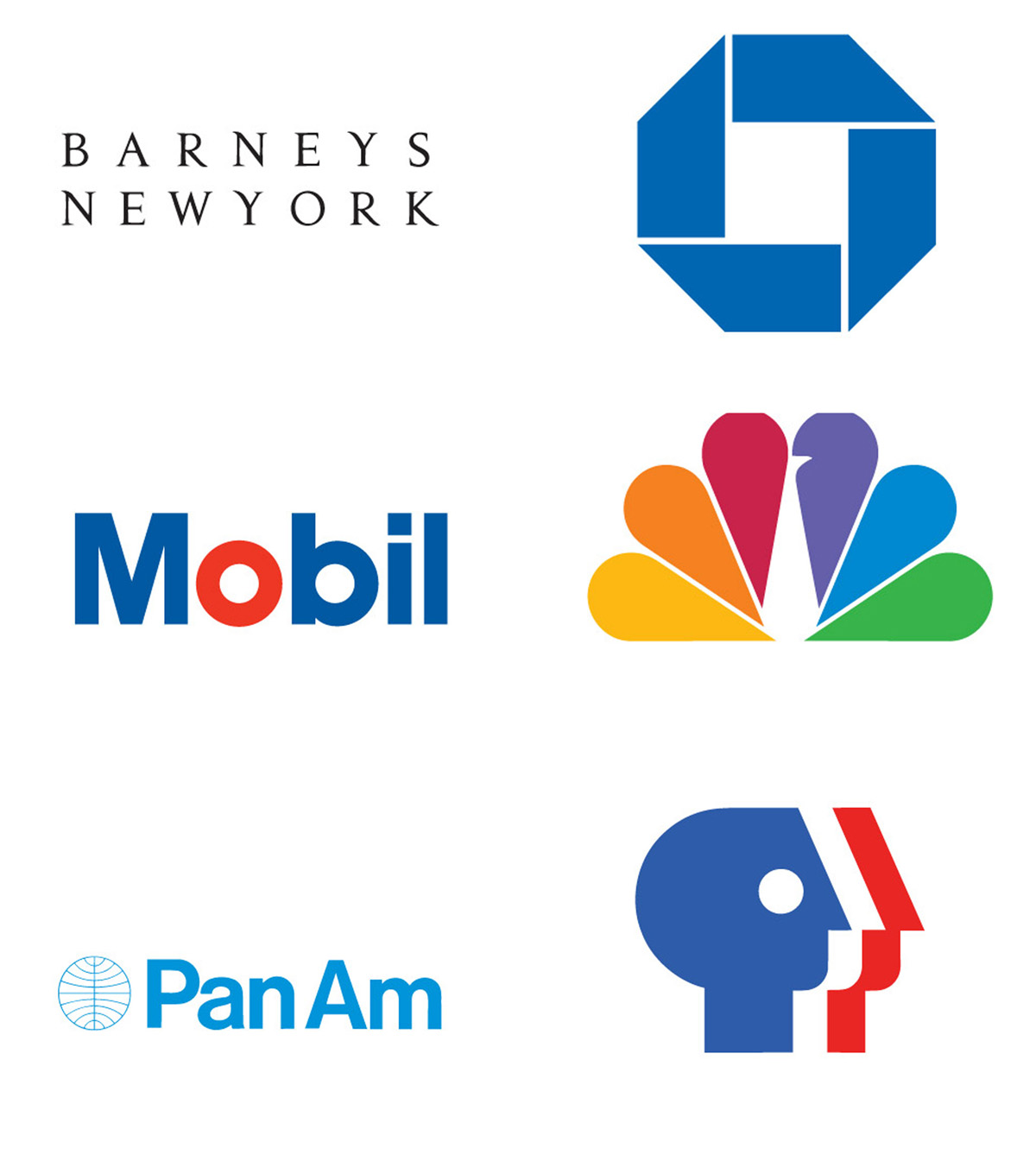
Chermayeff designed the Showtime logo, and the logos for National Geographic, Chase Manhattan Bank, the Smithsonian Institution, Mobil Oil (Exxon Mobil), the Library of Congress, and more.
AdvertisementIn a 2011 interview, Print magazine writer Aaron Kenedi quoted Chermayeff, who said, “A memorable identity is one that is appropriate, flexible, and distinguished by its originality.” Chermayeff also said a good trademark – a word mark or a symbol – should be devoid of fashion or trend. That makes it potentially iconic if it’s seen for long enough in the right places, he said.

Iconic? Chermayeff designed the 9-ft.-high, pop-art, red “9” sculpture that stands at 9 West 57th St., Manhattan. Fabricated out of half-inch steel plate, the big “9” weighs three tons.
During his career, graphic design as a practice evolved from “commercial art,” i.e., the Norman Rockwell era where, for example, advertising copy for a bank might be accompanied by a gouache-painted illustration of a cheery family standing alongside a bank vault. Designer Saul Bass, another Aspen Design Conference regular, brought the single image logo into design headlines with his 1955 title strip for The Man with a Golden Arm, a movie starring Frank Sinatra as a recovering heroin addict. See the title clip at http://www.artofthetitle.com/title/the-man-with-the-golden-arm.
Chermayeff, Bass, Milton Glaser, Paul Rand and a dozen others changed the design world. Like Frank Lloyd Wright affected architecture, they changed the graphic world by stepping around the complicated and overly ornamental designs of that time and introduced crisp, exciting and singularly explicit images to the world.
The New York Times writer Margalit Fox said Chermayeff’s philosophy of design was as simple as his design results, that his design firm’s work was known for sleek modernist designs, bold primary colors and was among the first to convey corporate identity by means of abstraction.
AdvertisementLike many designers, Chermayeff found ideas in the world around him. Writers David Stuart and Beryl McAlhone in their book A Smile in the Mind: Witty Thinking in Graphic Design, quoted Chermayeff as saying, “I do half my work in taxis, not in the office. As I go from one place to another thinking about things, I may suddenly have an idea and will put it down on paper. Sometimes the idea is okay, but it may evolve into other forms. My ideas may come quickly, or not at all. I have no compunction about driving around and being late if necessary.”
You can see why I liked the guy. Great designs and an intellectual but outside-the-box approach to work. Perhaps the best example of his unique thinking related to the Sept. 16, 2001 New York Times-commissioned illustration that accompanied an Op-Ed article about the Sept. 11 attacks. About this image, The Times’ Margalit Fox wrote, “The design he created is as simple as an illustration can get: just two letters, ‘U.S.,’ in bold black type. But in the finished image, Mr. Chermayeff has wrenched the ‘U’ from its moorings, leaving two jagged stumps where the letter once was. The result is wrenching to see.”
Ivan Chermayeff passed away on Dec. 3, 2017, at age 85.
Introducing the Sign Industry Podcast
The Sign Industry Podcast is a platform for every sign person out there — from the old-timers who bent neon and hand-lettered boats to those venturing into new technologies — we want to get their stories out for everyone to hear. Come join us and listen to stories, learn tricks or techniques, and get insights of what’s to come. We are the world’s second oldest profession. The folks who started the world’s oldest profession needed a sign.


INX Promotes Three to Vice President

6 Sports Venue Signs Deserving a Standing Ovation

Hiring Practices and Roles for Women in Sign Companies


Bulletins
Get the most important news and business ideas from Signs of the Times magazine's news bulletin.
-

 Tip Sheet4 days ago
Always Brand Yourself and Wear Fewer Hats — Two of April’s Sign Tips
-

 Business Management2 weeks ago
When Should Sign Companies Hire Salespeople or Fire Customers?
-

 Women in Signs2 weeks ago
2024 Women in Signs Award Winners Excel in Diverse Roles
-

 Real Deal5 days ago
A Woman Sign Company Owner Confronts a Sexist Wholesaler
-
 Benchmarks23 hours ago
6 Sports Venue Signs Deserving a Standing Ovation
-

 Editor's Note1 week ago
Why We Still Need the Women in Signs Award
-

 Line Time2 weeks ago
One Less Thing to Do for Sign Customers
-

 Product Buying + Technology1 week ago
ADA Signs and More Uses for Engraving Machines