Dimensional Signs
Carving the Dream
Lasting lettering for the MLK memorial in D.C.
Published
12 years agoon
Nick Benson was 15, and he needed a summer job. When his dad volunteered a spot at his own workshop, Nick agreed, ready for some easy cash (“I definitely thought of it as a summer job,”he remembered). So began his apprenticeship.
Nick’s father, John “Fud” Benson, became the owner of the John Stevens Shop, a Newport, RI stone-carving business, after his father, Nick’s grandfather, passed away. Founded in 1705, the workshop is among the oldest U.S. businesses to be in continual operation. Nick’s grandfather, John Howard Benson, took over the shop from the brother-in-law of the last remaining Stevens relative in 1927.
“It wasn’t until I was in college that I realized, ‘OK, this place is a little out of the ordinary,’” Nick said. “My dad brought me into the shop when I was 15 so I could learn how to carve and make money to go out and party with my buddies in the summer. I had a natural inclination to the craft, so my carving ability just took off. I was rough cutting work for my father by the time I was 17, and finish cutting by the time I was 18.”
Joe Moss, an Annapolis-based carver and sculptor, said, “Fud certainly worked at his father’s knee as a kid in the shop, and took over in the shop when he was 18 or 19. Nick certainly had the influence of a father who had the tradition of the grandfather. When you walk in the door of the shop, you immediately understand why Nick’s able to do what he does. There’s an enormous amount of history there.”
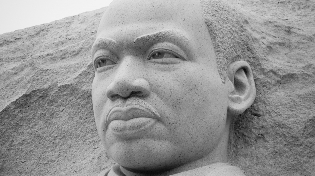
Fast-forward a few decades, and Nick, 47, has long since taken the reigns of the shop and developed an aesthetic all his own. Upon hearing that the recently opened Martin Luther King, Jr. National Memorial in Washington D.C. was being contracted out, he reached out to the design firm in charge. When that group broke away from the project, he called Dr. Ed Jackson, the Martin Luther King, Jr. National Memorial Project Foundation’s architect.
He pitched his skills, leveraging recent experience on the nearby World War II Memorial: “I just told him, ‘King’s quotes are so important, and they represent an important part of the memorial,’ and he said, ‘You’re right, they do.’” Nick spent the next 10 to 12 months developing and refining an alphabet he named “King,” then planning the inscription.
AdvertisementAny plan had to go through the U.S. Commission of Fine Arts, which holds veto power over every aspect of design for monuments on the National Mall, and turned down one of Nick’s plans, particularly objecting to any lettering that crossed joints, or seams where 5-ft. panels of stone came together.
The memorial’s final design incorporates a 30-ft. sculpture of King in Chinese granite, surrounded by a 450-ft. inscription wall with 14 carved quotations from King’s speeches, sermons and writing.
Design, in the lettering world, is what sets apart carvers from letterers. Basic carving technique can be taught in a year or two, and a couple additional years of training can turn the right person into a skilled carver.
The Bensons are not just a lettering family, but an artistic one as well. Nick’s older brother, Christopher Benson, is an accomplished figurative painter. An uncle, Richard Benson, won one of the 1986 MacArthur Fellowships – sometimes called “genius grants” – for his work in photography and photographic processing.
Nick’s work reflects this. “Design is first and foremost, particularly now,” he said. Several journeymen and a handful of other stone letterers do much of his carving work.
For Nick, design ranges from designing an alphabet (think font in 3-D), to laying out lines of text, to adding decorative figures, for example, to a headstone. He began his career as an art student in New York, and branched out by studying typography and calligraphy abroad.
AdvertisementAs he designed the King alphabet, Nick kept a planned, V-cut letter shape in mind. He and a cousin, Luke Benson, sandblasted inscriptions 1/16 to 1/32 in. deep into a granite retaining wall. Honed, Atlantic Green granite is “plucky,” Nick says, with a high surface tension that makes pure hand carving time consuming and difficult.
Not crossing seams meant the carvers would have to selectively broaden a few characters, or use supplemental characters to lengthen lines. Because each inscription is designed to be an area for contem-plation, Nick used long top lines, which fed into shorter lines under-neath for vertical cohesiveness within a quote, and horizontal flow among the wall’s multiple inscriptions.
The sans-serif King alphabet is all Roman caps, which appear bold and heavy in the granite retaining wall. The lettering design draws on the Claudian Roman era, whose alphabet’s broad forms and bold strokes contrast with the more delicate Trajan alphabet, which graces Rome’s landmark Trajan Column (think of the font used on many movie posters).
“I was also inspired by some ancient Greek inscriptions,” Nick said. “There’s an emphasis of stroke that I thought would add pizzazz on a large scale. I wanted the thing to have a hint of humanity to it, as if it were painted.”
Nick won a $500,000 MacArthur Fellowship last year, paid as five, annual installments. He’ll use some of the money “to keep the lights on,” but he also applied for a Rome Prize from the American Academy in Rome, which focuses on independent study and research in humanities and the arts. If he wins, he’ll spend six months in the heart of Italy studying lettering, perhaps even publishing a book of his findings afterward.
Studying in Rome, if he wins, will speak to Nick’s continuing, European education, which began with a year of study at the Basel School of Design in Switzerland while he was in college. Joe believes this training helped Nick widen his knowledge of lettering styles and develop his design skills.
AdvertisementThe Bensons are unique, explained Ann Hawkins. She studied under Fud and doubts anyone can currently equal Nick’s skill in design and lettering in the U.S. As Nick told memorialist Dan Bellan in 2009, “We pretty much live in our own world, and our dedication to this standard borders on monastic.” He doesn’t claim to have superseded his father, although he took over the shop in 1993.
Even today, Nick thinks his design could show some improvement. He likens his father’s skill to that of a virtuoso when asked to describe the difference in their work: “That is like asking a very accomplished pianist ‘Why do you think your version of Rondo alla Turca is not as good as Vladimir Horowitz’? It sounds the same to us.’ One has to spend decades drawing and carving letters to see what we see.”
Nick uses a combination of sandblasting and hand carving, especially when working with high-surface-tension stone like honed granite. For the MLK memorial, Joe said he carried a set of eight tungsten-carbide chisels that would become dull after about 90 minutes. Overall, the team exhausted nearly 100 chisels carving the inscriptions.
In addition, hand-carving variations create tiny imperfections which help create definition between light and shadow, lending hand-carved letters
a stately grace. Ann explained, “If it’s cut properly, the [V-cut] angle remains exactly the same, but, where the stroke is wide, it’s deeper, and, where it’s narrow, it’s shallow. That means that the light kind of flows through the letter. It’s really quite beautiful.”
Joe, who grew up in D.C., has visited the memorial several times since it opened. “I’ve worked on, let’s say, eight national memorials in Washington D.C. and I’ve never seen, at a memorial, so many people all showing emotion. Every time I’m there, I see so many people and they’re all showing emotion, either laughing, having a wonderful time, or sitting on benches, crying. I’ve never been to a memorial where so many people were uninhibited in emotional display.”
Sandblasting Versus Hand Carving
“Sandblasting is a very, very unpleasant way of getting a letter into stone. And as bad as it is in stone, it is eight times worse in wood because it has nothing to do with drawing letters, nothing to do with a solid understanding of the three-dimensional techniques and traditions. All it is is a way to slam another dimension onto a two-dimensional design.”
-John “Fud” Benson, May 1985, Signs of the Times, p. 114
If sandblasting is the “lingua franca of the sign trade,” as Nick notes, it is also the source of many a poorly executed project. Nick’s father, from whom the quote above is taken, designed and sandblasted D.C.’s Vietnam Veterans Memorial, which is a technical masterpiece of sandblasting.
The main problem with sandblasting is it creates characters carved a uniform depth into stone. Hand carving allows the carver to account for thicker and thinner strokes within a character, Ann Hawkins said, and better accommodates letters with varied stroke widths.
Think of an “R.” This letter comprises all three strokes used in English alphabet letters: a rounded bowl, vertical straight stroke, and tail (the diagonal part). In hand carving, the angle of a V-cut, for example, never changes; in Roman-based alphabets, letter depth is shallower where the stroke is thinner and wider where the stroke is thicker. Sandblasting can’t account for these variations.
Alphabets designed for carving – and most computerized fonts are decidedly not – also accomodate details like letter openings (think of the space in an “A”) that look odd on supersized, design-software fonts.
As Joe Moss explained, not all hand carving is equal: “There are carvers, and there are carvers.” He says he could pick Nick’s work out of a line-up. Ann also sees this distinction, defining letterers as “people who know how to draw a good letter and also have to carve it.”
Joe and Ann are members of a trusted inner-circle of stone carvers (or letterers, as some prefer to be called, particularly the Bensons) who tend to work alone, but call upon one another when the scope of a project or pressing deadlines call for extra, experienced hands; Joe was one of three carvers who worked with Nick on the MLK memorial.
Despite the obvious advantages of sandblasting – it’s faster and cheaper than hand carving – it’s hard to ignore Fud’s admonition: “Any yo-yo taking a black-and-white layout prepared by an art director or design firm, sticking it onto a piece of wood or stone, cutting a matte and blasting it in there, is not going to get anything that will have any validity as a full-scale, monumental [stone carved], three-dimensional object.”
SPONSORED VIDEO
Introducing the Sign Industry Podcast
The Sign Industry Podcast is a platform for every sign person out there — from the old-timers who bent neon and hand-lettered boats to those venturing into new technologies — we want to get their stories out for everyone to hear. Come join us and listen to stories, learn tricks or techniques, and get insights of what’s to come. We are the world’s second oldest profession. The folks who started the world’s oldest profession needed a sign.
You may like


Advertisement
Subscribe

Magazine
Get the most important news
and business ideas from Signsofthetimes Magazine.
Advertisement
Most Popular
-

 Business Management1 week ago
When Should Sign Companies Hire Salespeople or Fire Customers?
-

 Women in Signs1 week ago
2024 Women in Signs Award Winners Excel in Diverse Roles
-

 True Tales2 weeks ago
Sign Company Asked to Train Outside Installers
-

 Editor's Note5 days ago
Why We Still Need the Women in Signs Award
-

 Maggie Harlow2 weeks ago
The Surprising Value Complaints Bring to Your Sign Company
-

 Line Time1 week ago
One Less Thing to Do for Sign Customers
-

 Product Buying + Technology7 days ago
ADA Signs and More Uses for Engraving Machines
-

 News2 weeks ago
MUTOH Partners With Wasatch for RIP Software Package